
Thursday, 16 December 2010
LIIAR Analysis of Billboard magazine cover

Language - The people on the front, the Glee cast and the artists whose songs they have done covers of, are looking straight at the camera, which makes the viewer feel like they're looking right at them. This makes them feel involved and is supported by the sheer amount of eyes looking back at them. The long shot makes the scene seem quite impersonal, which isn't really a good thing . The coverline 'The Power of Glee' is actually a bit of a play on the fact that the Glee Cast made an album of Madonna songs called the 'The Power of Madonna'. The white that 'The Power of' is in matches well with the white of the masthead, which gives it a sense of unity. The fact that the word 'Glee' is in capital letters, boldened and in bright green makes it stand out really well against the rest of the cover. The little subheading underneath the main headline says 'from smash hits to a sold-out tour, how a TV musical about high school geeks became a singular success', which is a good summary of the story and the word 'singular' is really effective because it has the word sing in it, what the Glee Cast do. Most of the people are smiling on this picture, which makes them all seem very cheerful and friendly and you want to read more about people who are nice. The pictures have all been superimposed together due to the fact that all the people on it are quite popular people and it would be very hard to get all those people available for a cover shoot on the same day. Plus some of the pictures, like the one of Madonna, are from a long time ago and literally couldn't be reshot. The pictures look like they've taken a long time to find because they're all very meaningful images. Like the one of Cory Monteith, it's important that they capture his character exactly right so they've scoured and found a picture of him holding his football helmet to show that he's a football player.
Institution - The institution is Billboard magazine, which in turn is owned by the institution of Prometheus Global Media. Prometheus is an American publisher, as is Billboard magazine, and also publishes The Hollywood Reporter, Back Stage and Film Journal International, which are all magazines that have something to do with show business. Due to this, I assume that Billboard is also quite a bit to do with show business. If it isn't then it doesn't really fit in with the theme of the brand. However, I do think that this magazine is to do with that because the Glee Cast is on the cover and she is a huge star internationally. Due to the fact that the magazines published by Prometheus are all to do with one main aspect, we can see that they are not very diverse and maybe do not cater for all tastes.
Ideology - The fact that there's a person in a wheelchair on the cover really emphasizes the fact that the magazine is very much a believer in everybody is equal and nobody should be treat differently just because they are in wheelchair. There's also an Asian on the cover, which rids of any doubt that the magazine has any problem with race issues.
Audience - Due to the fact that Prometheus (the institution that owns Billboard) sells lots of show business related magazines, I assume that this magazine is also to do with show business. If it is then the audience of the magazine will be people who are interested in that kind of thing just as a spectator or who are interested in pursuing a career in show business.
Representation - The magazine using the Glee Cast as their cover models is very good publicity due to the fact that the whole idea of Glee is a group of people who are outcasts, but can be something amazing. It gives out a good message to people and tells their readers that they support people being themselves. This gives them good publicity.
Friday, 10 December 2010
LIIAR Analysis of Kerrang double page spread

Language - The lead singer, Billie Joe Armstrong, of the band, Green Day, is looking straight at the viewer, making them feel involved. The bassist and backing vocalist, Mike Dirnt, is also looking straight at the viewer, which creates double the effect. The fact that the drummer, Tre Cool, is not looking attracts attention because he is the only one who isn't, which is intriguing. The same effect occurs when you notice that Mike is not holding a grenade like the other two. The image is a medium shot, which is quite a neutral shot as it creates no statement, unlike a close-up which suggests intimacy. Even from this far away, however, we can see that the band are all wearing makeup on their eyes, which does make a statement. Makeup on men is uncommon, which is why it's so shocking to people when men do wear it. The fact that the trio are wearing makeup tells us that they like to be controversial and like to be unconventional. Most men would be embarrassed to wear makeup in public, but these three flaunt it because they are not ashamed of what they do. The fact that the magazine chose to feature this band even though they're wearing makeup tells us that Kerrang magazine likes the controversial, unconventional kinds of people that others would shun. It also tells us that Kerrang like the shock the reader by using people most people wouldn't think about hiring to be in the magazine. The magazine no masthead due to this being a double page spread as opposed to a cover, however, it does feature a title which reads 'Foxboro Hot Tubs'. The title isn't really that interestingly named, nor is it that eye-catching due to the boring colour chosen for it.
Institution - The institution for this particular magazine is Kerrang, which is part of the bigger institution of Bauer Consumer Media. Bauer produces lots of magazines, from sport magazines to women's weeklies, which tells us that they are quite a diverse company, either that or they know that they can make more money if they make more different types of magazine.
Ideology - The fact that the main image is a picture of a group of men all wearing makeup tells us that this magazine does not turn its nose up at people who do not stick to the usual conventions. The men know that they don't look like people want them to, but they don't care about what other people think because they know who they are. The magazine feels the same way - they know what they are like and don't want to compromise that to suit other people.
Audience - The audience is basically anybody who likes rock music, though more specifically it's aimed at younger people. You would expect it to be students or people who unemployed people due to the price, which is £1.80, as it's not too high for people from the E social classification to buy.
Representation - The people in the main image tell us that the magazine tends to feature those who don't comply with normal rules and regulations and do what they want, for example men who wear makeup. The magazine accepts those members of society who nobody else would, the oddballs so to speak, and moulds them so that they fit into their magazine. They don't change them, they let them be who they want to be, they just help them in reaching their full potential by featuring them in the magazine that lots of people buy. In return, the people featured pay back the favour by promoting the magazine. This is an example of synergy.
Friday, 26 November 2010
LIIAR Interpretation of Kerrang magazine contents page

Institution - The institution is Kerrang, obviously, which is a segment of the institution of Bauer Consumer Media. Bauer publish a few different types of magazines, a lot of them very different from this one. They publish magazines about sport, music, lifestyle and gossip, etc. The company produce lots of different types of magazines, which is probably a tactic so that they can make more money than if they only published one magazine.
Ideology - Most of the images on this contents page are of people singing or playing music, which tells us that the magazine is one that loves its music. The main image depicts a man swearing, which tells us that they don't care about whether their content offends people.
Audience - The audience is, I suppose, anybody who likes rock music. Mostly, it's aimed at young males that are unemployed or are students. This doesn't mean, however, that other types of people can't like it because they can, as I said before anybody who likes rock music will probably like this magazine. The price is £1.80, which makes me think it's for young people because that's quite cheap for a music magazine. It could also suggest it's for unemployed people because they don't have much money either. Basically, the magazine is aimed at rock-music lovers and people from classification E in the social classifications.
Representation - The guy in the main image tells us that the magazine features only those who don't comply with usual conventions and go against what other people think they should be like. The other images suggest this too as they are all quite rough-looking people, who would not be accepted into other societies but fit perfectly in this magazine, representing what the magazine wants representing. It's lucky for both of them really because the model gets promotion in the magazine and the magazine gets promoted by the model. It's a perfect example of synergy.
Friday, 19 November 2010
LIIAR Interpretation of Kerrang magazine cover

Language - The model, named Brian Molko I'm assuming from the headline, is looking straight at the viewer, which makes them feel involved. The intensity of the stare supports this feeling profusely due to the fact that it makes you feel like he's looking straight inside you. The camera is at an extreme close-up, which gives the image a sense of intimacy, like it's just you and him alone. He's wearing quite a fair bit of makeup because, in this proximity, you'd be able to see lots of imperfections that you wouldn't spot from any further away. The makeup isn't just to cover up any imperfections; it's part of his image. Without the makeup his image would be in tatters and without an image he'd just be like any other singer - boring, ordinary and just another face in the crowd. With a little bit of makeup and some funky clothes he goes from regular nobody to singing superstar, which is what every singer wants to be. The masthead is black on a a red background, which is very striking and stands out a lot. The name of the magazine is striking in itself as it's sort of a use of onomatopoeia. The word Kerrang sounds a bit like an electric guitar sound. It sounds dynamic and exciting and makes you think of rock music.
Institution - The institution is Kerrang, which in turn part of the institution of Bauer Consumer Media. Bauer also publish Heat, Match and Yours, which are all very different to Kerrang. The fact that they publish so many varieties of magazine tells us that the company is very diverse and they cater for all types of people so as to broaden their appeal. Also, the model is obviously an unconventional character, but he's on the front of their magazine, which makes us think they don't discriminate against the strange types of people.
Ideology - The fact that the model wears makeup tells us that the magazine doesn't care about whether the person looks odd, they are more interested in the music. They don't care about what kind of morals a person has or how they look, they focus specifically on the music that person plays. That isn't to say that they don't like to make an impact because they really do. They like to choose the most shocking of people, a man wearing makeup is the definition of shocking, so as to really stand out from the other rock music based magazines. We know they like to shock people by the few headlines that read 'What's wrong with cannibalism? Murderdolls bite back!' because cannibalism is illegal and it's like they're promoting it, which would certainly shock people. Going back to the model, his look, which is quite unique, tells us that it's okay to be different and not comply with the conventions other people expect.
Audience - The target audience is any person who enjoys rock music. Those would mainly be young males, however, the magazine could appeal to anyone who's into that type of music. The price reflects the aim that it's for young people because it costs £1.80, which is fairly cheap, cheap enough for a student to buy it. It would be cheap enough for people from the E class in the social classifications to buy.
Representation - The model on the front tells us that the magazine promotes those who have an edge to them, who don't comply with the rest of the world's expectations. In reverse, this tells us that Brian Molko on the front cover promotes magazines who like unique people like him. The two aspects, the magazine and model, use each other for promotion opportunities. This is an example to synergy, where one piece of media helps another in return for help from them. The model is using the magazine to sell his tour and the magazine is using him to sell them. It's a simple cycle. The magazine presents the model as something to aspire to somebody to look up to and hope to be like one day. He wants to be a role model to people and they want somebody to use as a role model on their magazine.
Wednesday, 10 November 2010
LIIAR Interpretation of the Brief
Language -Camera angles/positioning/distance
- Conventions/codes
- Layout - house-style (the look of the music magazine needs to be consistent)
- Splash (the cover once finished)
Institution - Q (Bauer)
- Hammer (Future)
- Mix Mag (Development Hell Ltd)
- NME (IPC)
- DJ (Chris Kempston (published independently))
Ideology - All have own values/messages/morals
- Presenting stars in aspirational terms
Audience - Target audience
- Gender/age/social classifications
A - Upper class
B - Middle class
C1 - Lower middle class
C2 - Skilled working class
D - Working class
E - Under class, long-term unemployed, students
Representation - Front cover represents magazine and audience
- Re-presenting images/values
- Aspirational
- Presenting aspects of society and our aspirations back to us
- Synergy (when one piece of media helps another, mutually supporting each other, the singer using the magazine to promote tour and album while the company uses the singer to promote their magazine)
Music Magazine Brief
The front page, contents and double page spread of a new music magazine. All images and text used must be original, produced by you - minimum of four images.
Friday, 22 October 2010
Evaluation
Evaluation
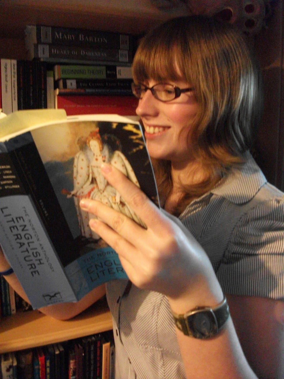
I think the font of the title worked because it’s sort of old, fancy calligraphy, the sort of writing that they would use in olden times. Obviously, olden times are studied a lot in English, in Language when you’re studying the origins of words and in Literature when you are studying old texts. Plus it’s quite a characteristic font, which means that it’ll stand out and people will remember the magazine because of it. I like that I changed the font for the subtitles because it makes it look more professional with a bold title and then simple headlines. I quite liked the picture I took because it shows the student is smiling because they are enjoying their book as well as showing the name of the book well. The fact that the student is smiling and enjoying their book gives the impression that English is fun. You can’t see the background all that well, which is a shame because I spent a while trying to find the best place to have the photo set, but it is by a bookshelf in a library and because the student is looking happy, this indicates that libraries are fun. I like the name of my magazine (English at Wyke) because it gets straight to the point with it and tells us exactly what the magazine is about.
The target audience is students at Wyke studying English. I have decided that my magazine will be about both types of English, Language and Literature, so as to broaden the target audience. Because the girl is reading a heavy English book, the image on the front tells us that the magazine is aimed at those who like to read intellectual things. She’s dressed smartly so as to tell us that she is serious about her education and wants to succeed in all endeavours. Of course, it’s not just aimed at those studying English at Wyke, it could be for anybody who is interested in English. Some articles, however, may not to apply to people who do not study English or do not study it at Wyke. The subtitle ‘Last bookings for Haworth trip’ is a good example of how that may not apply to people who are not studying English at Wyke. Plus, if you don’t know who David Green and Belinda Hakes are, the main story will also be irrelevant to them.
I created my magazine cover using Adobe Photoshop, first using Microsoft PowerPoint to plan it out. I encountered no problems other than picking a decent photo. I’d taken a lot of photos and most of them were good enough to use on my magazine, but I couldn’t pick. I eventually decided on the photo I used because you could see the name of the book better in that one than any of the others. My model’s smile was also more genuine in that picture than the other ones.
I think I could improve my magazine cover by taking a picture where the background was clearer so you could see that she was sat in a library. I could come up with a better tagline and more interesting stories. Maybe it would be better if I had more than one student in the picture too so that they looked like they were sharing the fun.
Thursday, 21 October 2010


Language - The girl is wearing a school unifrom so as to tell the readers that she is a schoolgirl. Her smile indicates that she is enjoying her schooling. The scroll, rosette, desk and banners superimposed into the picture suggest that the girl has been very successful and won some kind of competition due to her being so smart. She's looking at the viewer, which makes them feel involved or like they are being singled out. Because it's a girl on the front, the magazine may be aimed mainly at girls. though the colour scheme does not suggest this. If the colours were more feminine we would believe that. The girl has a vibrant colour of hair, which tells us the magazine does not discriminate people with different hair.
Institution - The institution is unknown due to the fact that the name features no name other than 'Secondary Teachers'
Ideology - The fact that the girl is ginger tells us the institution does not discriminate against hair colour. The fact that the model has her tie pulled right up tells us that the institution believes in students dressing smartly and looking presentable. Her hair is down, but looks smart, which tells us that the institution has no problem with how students do their hair. The subheading 'Jamie Cullum: why music is a must' tells us the magazine has status because they can afford to interview a famous star for their magazine.
Audience - The audience is teachers, I assume, due to the fact that the name is Secondary Teachers. However, the picture looks quite childish and bright, something that would attract children, which makes me think it's maybe aimed at both teachers and students. The model is pretty, which appeals to girls because they'll see her like a role model if they think she looks nice.
Representation - Girls are represented by the female model, who is attractive so as to make females look good. People with red hair are represented by the pretty girl too.
Wednesday, 20 October 2010

Wednesday, 13 October 2010
LIIAR Interpretation of a College Magazine

Language - the male on the front is looking at the viewer, which makes them feel like they are being involved. He's smiling, which gives the impression that college is fun and he is enjoying it. He's holding books as if to convince the viewer that he is an academic college student. Because it's a male on the front, the magazine may be aimed at boys alone or boys and girls. The colours suggest it's aimed at males. His attire is fairly smart, indicating that the magazine is aimed at fairly smart people. He's black, which tells us the college does not discriminate against races.
Institution - The institution is unknown due to the fact that the magazine does not feature a name other than 'College Lifestyle'.
Ideology - The fact that the model is holding books about law, society and business indicate that the magazine has values and society is important to them. They believe that society and abiding by laws is very important so show this in the books they have displayed. The model is wearing a cross necklace, which could, on some level, indicate that the magazine is religious. This could, however, be negated by their casual use of blasphemy in the subheading 'Thank God it's Friday's'. I assume this subheading should be 'Thank God it's Friday', but somebody has written it wrong, so if that is the case then this shows the magazine does not give much thought to grammar and spelling mistakes. The colour of the model's skin tells us the magazine do not discriminate against black people.
Audience - The audience, obviously, is college students. However, what specific portion of college students it is aimed at could be anybody's guess. It is probably aimed at boys because the person on the front is male and the colours are fairly masculine, but it could be aimed at both sexes and the colours are meant to symbolise both genders.
Representation - Males are represented by the model on the front of the magazine, who is, I assume, supposed to be attractive to make the male population look better. Black people are represented also by this model because they are a minority group and the producers of the magazine have chosen him to represent them in a good way.
Friday, 8 October 2010
LIIAR Interpretation of the Brief
Language - The photo on the cover of my magazine will be a medium close-up of a smiling girl reading a copy of Jane Eyre or Wuthering Heights, wearing smart but fairly casual clothes. The camera is at her height, as if from the perspective of another student. This should imply that the magazine is aimed at students studying English. The smile is to show that the student is having fun reading her book, basically that English is fun. She is sat in a library to show that libraries are fun too.
Institution - Wyke College is the main institution, but I think the English Department is a part of it too. Wyke College is a college that promotes variety and lets people be who they want to be, which means that those are the same sort of ideas that the magazine promotes. In reverse, that also means that any ideas that the magazine promotes that the college hasn't particularly expressed will be linked too.
Ideology - The photo on the front should provide ample evidence that idea of the magazine is to give to pupils studying English, as I'm sure the title (English at Wyke) will. The fact that Wyke College is connected to the magazine will tell people about the morals and ideals that the magazine believes in.
Audience - The audience should be any person studying English and Wyke College who believes in the morals the magazine and college promote. The people reading the magazine should be people who enjoy English or want to know a little more about it. The articles in the magazine will range from language issues to literature ones so as to engage all readers in it, therefore attracting a broader audience than if it were focused on one aspect.
Representation - The magazine represents students studying English or just people who are interested in English. It represents people who believe in the morals that the college believes in.
Tuesday, 5 October 2010
College Magazine
Preliminary exercise: Using DTP and an image manipulation program, produce the front page of a new school/college magazine, featuring a photograph of a student in medium close-up plus some appropriately laid-out text and a masthead. Additionally you must produce a mock-up of the layout of the contents page to demonstrate your grasp of DTP.
Subscribe to:
Posts (Atom)