Friday 22 October 2010

Evaluation

Evaluation


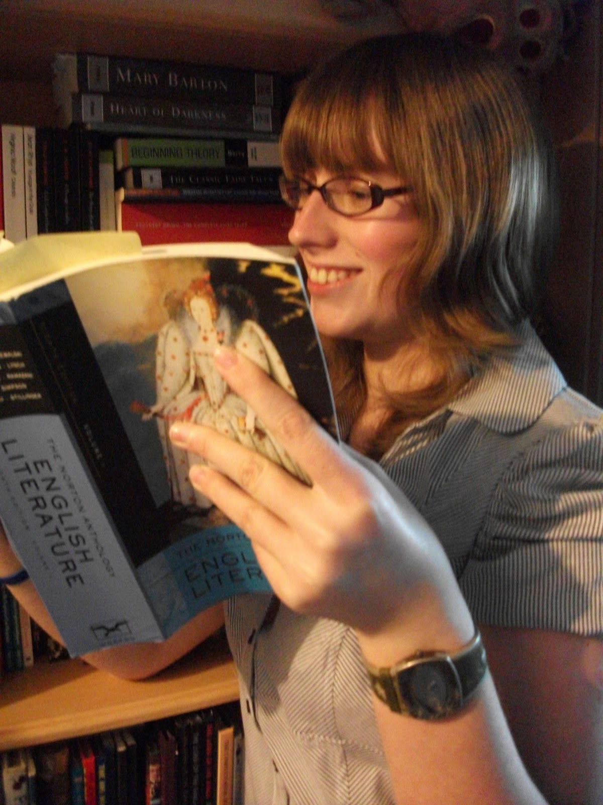
I think the font of the title worked because it’s sort of old, fancy calligraphy, the sort of writing that they would use in olden times. Obviously, olden times are studied a lot in English, in Language when you’re studying the origins of words and in Literature when you are studying old texts. Plus it’s quite a characteristic font, which means that it’ll stand out and people will remember the magazine because of it. I like that I changed the font for the subtitles because it makes it look more professional with a bold title and then simple headlines. I quite liked the picture I took because it shows the student is smiling because they are enjoying their book as well as showing the name of the book well. The fact that the student is smiling and enjoying their book gives the impression that English is fun. You can’t see the background all that well, which is a shame because I spent a while trying to find the best place to have the photo set, but it is by a bookshelf in a library and because the student is looking happy, this indicates that libraries are fun. I like the name of my magazine (English at Wyke) because it gets straight to the point with it and tells us exactly what the magazine is about.
The target audience is students at Wyke studying English. I have decided that my magazine will be about both types of English, Language and Literature, so as to broaden the target audience. Because the girl is reading a heavy English book, the image on the front tells us that the magazine is aimed at those who like to read intellectual things. She’s dressed smartly so as to tell us that she is serious about her education and wants to succeed in all endeavours. Of course, it’s not just aimed at those studying English at Wyke, it could be for anybody who is interested in English. Some articles, however, may not to apply to people who do not study English or do not study it at Wyke. The subtitle ‘Last bookings for Haworth trip’ is a good example of how that may not apply to people who are not studying English at Wyke. Plus, if you don’t know who David Green and Belinda Hakes are, the main story will also be irrelevant to them.
I created my magazine cover using Adobe Photoshop, first using Microsoft PowerPoint to plan it out. I encountered no problems other than picking a decent photo. I’d taken a lot of photos and most of them were good enough to use on my magazine, but I couldn’t pick. I eventually decided on the photo I used because you could see the name of the book better in that one than any of the others. My model’s smile was also more genuine in that picture than the other ones.
I think I could improve my magazine cover by taking a picture where the background was clearer so you could see that she was sat in a library. I could come up with a better tagline and more interesting stories. Maybe it would be better if I had more than one student in the picture too so that they looked like they were sharing the fun.

Thursday 21 October 2010

Pictures not used on cover


Mock-up of contents page

Plan of magazine cover


Language - The girl is wearing a school unifrom so as to tell the readers that she is a schoolgirl. Her smile indicates that she is enjoying her schooling. The scroll, rosette, desk and banners superimposed into the picture suggest that the girl has been very successful and won some kind of competition due to her being so smart. She's looking at the viewer, which makes them feel involved or like they are being singled out. Because it's a girl on the front, the magazine may be aimed mainly at girls. though the colour scheme does not suggest this. If the colours were more feminine we would believe that. The girl has a vibrant colour of hair, which tells us the magazine does not discriminate people with different hair.
Institution - The institution is unknown due to the fact that the name features no name other than 'Secondary Teachers'
Ideology - The fact that the girl is ginger tells us the institution does not discriminate against hair colour. The fact that the model has her tie pulled right up tells us that the institution believes in students dressing smartly and looking presentable. Her hair is down, but looks smart, which tells us that the institution has no problem with how students do their hair. The subheading 'Jamie Cullum: why music is a must' tells us the magazine has status because they can afford to interview a famous star for their magazine.
Audience - The audience is teachers, I assume, due to the fact that the name is Secondary Teachers. However, the picture looks quite childish and bright, something that would attract children, which makes me think it's maybe aimed at both teachers and students. The model is pretty, which appeals to girls because they'll see her like a role model if they think she looks nice.
Representation - Girls are represented by the female model, who is attractive so as to make females look good. People with red hair are represented by the pretty girl too.

Wednesday 13 October 2010

LIIAR Interpretation of a College Magazine


Language - the male on the front is looking at the viewer, which makes them feel like they are being involved. He's smiling, which gives the impression that college is fun and he is enjoying it. He's holding books as if to convince the viewer that he is an academic college student. Because it's a male on the front, the magazine may be aimed at boys alone or boys and girls. The colours suggest it's aimed at males. His attire is fairly smart, indicating that the magazine is aimed at fairly smart people. He's black, which tells us the college does not discriminate against races.
Institution - The institution is unknown due to the fact that the magazine does not feature a name other than 'College Lifestyle'.
Ideology - The fact that the model is holding books about law, society and business indicate that the magazine has values and society is important to them. They believe that society and abiding by laws is very important so show this in the books they have displayed. The model is wearing a cross necklace, which could, on some level, indicate that the magazine is religious. This could, however, be negated by their casual use of blasphemy in the subheading 'Thank God it's Friday's'. I assume this subheading should be 'Thank God it's Friday', but somebody has written it wrong, so if that is the case then this shows the magazine does not give much thought to grammar and spelling mistakes. The colour of the model's skin tells us the magazine do not discriminate against black people.
Audience - The audience, obviously, is college students. However, what specific portion of college students it is aimed at could be anybody's guess. It is probably aimed at boys because the person on the front is male and the colours are fairly masculine, but it could be aimed at both sexes and the colours are meant to symbolise both genders.
Representation - Males are represented by the model on the front of the magazine, who is, I assume, supposed to be attractive to make the male population look better. Black people are represented also by this model because they are a minority group and the producers of the magazine have chosen him to represent them in a good way.

Friday 8 October 2010

LIIAR Interpretation of the Brief

Language - The photo on the cover of my magazine will be a medium close-up of a smiling girl reading a copy of Jane Eyre or Wuthering Heights, wearing smart but fairly casual clothes. The camera is at her height, as if from the perspective of another student. This should imply that the magazine is aimed at students studying English. The smile is to show that the student is having fun reading her book, basically that English is fun. She is sat in a library to show that libraries are fun too.
Institution - Wyke College is the main institution, but I think the English Department is a part of it too. Wyke College is a college that promotes variety and lets people be who they want to be, which means that those are the same sort of ideas that the magazine promotes. In reverse, that also means that any ideas that the magazine promotes that the college hasn't particularly expressed will be linked too.
Ideology - The photo on the front should provide ample evidence that idea of the magazine is to give to pupils studying English, as I'm sure the title (English at Wyke) will. The fact that Wyke College is connected to the magazine will tell people about the morals and ideals that the magazine believes in.
Audience - The audience should be any person studying English and Wyke College who believes in the morals the magazine and college promote. The people reading the magazine should be people who enjoy English or want to know a little more about it. The articles in the magazine will range from language issues to literature ones so as to engage all readers in it, therefore attracting a broader audience than if it were focused on one aspect.
Representation - The magazine represents students studying English or just people who are interested in English. It represents people who believe in the morals that the college believes in.

Tuesday 5 October 2010

College Magazine

Preliminary exercise: Using DTP and an image manipulation program, produce the front page of a new school/college magazine, featuring a photograph of a student in medium close-up plus some appropriately laid-out text and a masthead. Additionally you must produce a mock-up of the layout of the contents page to demonstrate your grasp of DTP.